Theme
Styling the widget has two layers:
themePreset— pick a built-in base palette:"dark"(default) or"light". Both use the Kraken pink accent.theme— override individual values (colours, fonts, sizing, trigger placement) on top of the selected preset. You can also set the equivalent CSS variables directly on the host element.
Stacking is controlled by stackZIndex (the base layer for the floating
trigger). The panel always sits one step above (stackZIndex + 1).
Dark & light presets
The widget ships with two complete palettes. themePreset selects which one is
used as the base.
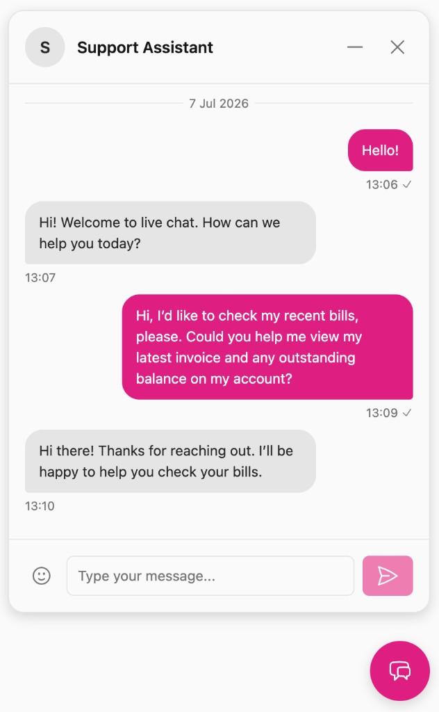
themePreset: 'light'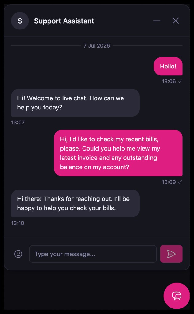
themePreset: 'dark' (default)setConfig({
apiUrl,
accountNumber,
userEmail,
themePreset: 'light', // "dark" (default) | "light"
});
themePresetis a top-level config key — a sibling oftheme, not a key inside it.- If omitted or set to an unknown value, the widget uses
"dark". - The preset only sets the base palette. Any keys you set in
themestill win (see Overriding specific values).
The widget does not automatically follow the operating system's colour scheme — it renders the preset you choose. To mirror the OS (or your app's) theme, switch the preset yourself; see Following the OS colour scheme.
Overriding specific values
Set only the keys you want to change; everything else comes from the selected
preset. This works with or without themePreset.
setConfig({
  apiUrl,
  accountNumber,
  userEmail,
  themePreset: 'light',
  theme: {
    userBubbleBgColor: '#2563eb', // override just the user bubble colour
    borderRadius: '0.5rem',
    fontSize: '14px',
  },
});
Order of precedence (highest wins):
theme overrides → selected themePreset → default preset ("dark")
Because the theme gives you full control over colours, fonts, and sizing, it's your responsibility to keep the result accessible — the widget can't enforce this for you. When overriding values, verify:
- Contrast between text and its background meets WCAG AA
(at least 4.5:1 for body text, 3:1 for large text). This applies to message
bubbles (
userBubble*,botBubble*), body text, and muted text. - Readability — avoid overly small
fontSizevalues or hard-to-readfontFamilychoices. - Changes still hold up in both light and dark contexts if your site switches presets.
A quick way to check is your browser's DevTools accessibility/contrast inspector, or a checker like the WebAIM Contrast Checker.
Overriding via CSS variables
Instead of (or in addition to) the theme object, you can set CSS variables on
the ink-live-chat-widget host element:
ink-live-chat-widget {
  --ilcw-bg-color: #16161e;
  --ilcw-user-bubble-bg-color: #df1d80;
  --ilcw-font-size: 16px;
  --ilcw-trigger-size: 4.5em;
  --ilcw-trigger-panel-gap: 1em;
}
Or imperatively on the element instance:
document
  .querySelector('ink-live-chat-widget')
  .style.setProperty('--ilcw-user-bubble-bg-color', '#2563eb');
Each variable is --ilcw- plus the kebab-case theme key — for example,
userBubbleBgColor becomes --ilcw-user-bubble-bg-color. See the
CSS variable reference below.
Following the OS colour scheme
To make the widget track the visitor's OS preference (or your app's own
light/dark toggle), pick the preset with matchMedia and update it when it
changes:
const query = window.matchMedia('(prefers-color-scheme: dark)');

const el = init(document.getElementById('chat-root'), {
  apiUrl,
  accountNumber,
  userEmail,
  themePreset: query.matches ? 'dark' : 'light',
});

query.addEventListener('change', (e) => {
  el.setConfig({ themePreset: e.matches ? 'dark' : 'light' });
});
Any per-key theme overrides you set continue to apply on top of whichever
preset is active.
Default values by preset
Colour values differ between presets; the sizing/typography values are shared.
Colours
| Key | Dark (default) | Light | Host CSS variable | Description |
|---|---|---|---|---|
bgColor | #16161e | #fafafa | --ilcw-bg-color | Background of the chat panel and the message-input area. |
borderColor | #2a2a38 | #e5e5e5 | --ilcw-border-color | Borders and dividers — panel edge, header/input separators, date separators. |
botBubbleBgColor | #2a2a38 | #e5e5e5 | --ilcw-bot-bubble-bg-color | Background of inbound message bubbles (from the support side — bot or human agent). |
botBubbleTextColor | #f0f0f8 | #262626 | --ilcw-bot-bubble-text-color | Text colour inside inbound (support) bubbles. |
textColor | #f0f0f8 | #171717 | --ilcw-text-color | Primary text — header title, empty-state title, and general body copy. |
textColorMuted | #8080a0 | #737373 | --ilcw-text-color-muted | Secondary/muted text — message timestamps & delivery meta, date separators, and the empty-state description. Lower emphasis than textColor. |
userBubbleBgColor | #df1d80 | #df1d80 | --ilcw-user-bubble-bg-color | Background of the visitor's own message bubbles and the floating trigger button. |
userBubbleTextColor | #ffffff | #ffffff | --ilcw-user-bubble-text-color | Text/icon colour inside user bubbles and on the trigger button. |
shadow | 0 4px 12px rgba(0, 0, 0, 0.15) | 0 4px 12px rgba(0, 0, 0, 0.15) | --ilcw-shadow | Drop shadow applied to the panel and floating trigger. |
Sizing & typography (shared by both presets)
| Key | Default | Host CSS variable | Description |
|---|---|---|---|
borderRadius | 1em | --ilcw-border-radius | Corner radius for the panel, message bubbles, and controls. |
fontFamily | system-ui, -apple-system, sans-serif | --ilcw-font-family | Base font family for all widget text. |
fontSize | 16px | --ilcw-font-size | Base font size. All other text scales relative to this using em, so this effectively controls the overall widget scale. |
stackZIndex | 99999 | --ilcw-widget-z-index | Base stacking order (z-index) for the floating trigger. The panel sits one step above (this value + 1). Raise it if the widget is hidden behind other fixed elements. |
triggerEdgeInset | 1.5em | --ilcw-trigger-edge-inset | Distance from the viewport edge(s) to the floating trigger. |
triggerPanelGap | 1em | --ilcw-trigger-panel-gap | Gap between the floating trigger and the chat panel when it is open. |
triggerSize | 4.5em | --ilcw-trigger-size | Diameter of the floating trigger button. |
triggerPosition | bottom-right | (sets data-ilcw-trigger-position on the element) | Which viewport corner the trigger sits in: bottom-right, bottom-left, top-right, or top-left. |
triggerPosition is not a colour/size variable — it sets a
data-ilcw-trigger-position attribute on the element (bottom-right,
bottom-left, top-right, or top-left) used for layout positioning.
CSS variable reference
All host CSS variables, for quick copy/paste:
ink-live-chat-widget {
  --ilcw-bg-color: ;
  --ilcw-border-color: ;
  --ilcw-border-radius: ;
  --ilcw-bot-bubble-bg-color: ;
  --ilcw-bot-bubble-text-color: ;
  --ilcw-font-family: ;
  --ilcw-font-size: ;
  --ilcw-shadow: ;
  --ilcw-widget-z-index: ;
  --ilcw-text-color: ;
  --ilcw-text-color-muted: ;
  --ilcw-trigger-edge-inset: ;
  --ilcw-trigger-panel-gap: ;
  --ilcw-trigger-size: ;
  --ilcw-user-bubble-bg-color: ;
  --ilcw-user-bubble-text-color: ;
}